Tipbox is a multi-tenant platform designed to securely connect teams across various organizations, facilitating real-time collaboration through powerful tools and flexible integrations. As organizations increasingly rely on collaborative efforts with contractors and vendors, Tipbox aims to address the significant challenges posed by security concerns in project-based collaborations.
The Challenge
Project-based collaboration often involves multiple stakeholders, leading to complex workflows and heightened security risks. Traditional collaboration is frequently inadequate for safeguarding sensitive information, making it challenging for teams to effectively work together.
Project Overview
I joined the Tipbox team at a critical juncture when the core software had been recently developed and applied to a staging environment. However, the UX was disjointed and there were several key features that needed to be designed and built to meet the MVP target for launch. My primary responsibility was to collaborate with the Creative Director to complete the necessary features and fix the confusion around the software’s UX.
Responsibilities
Update task management UX
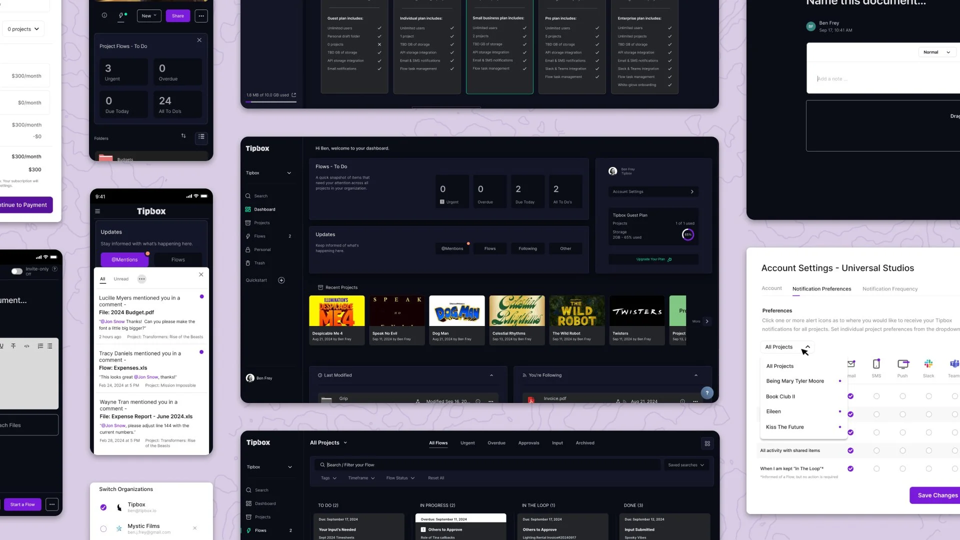
Right out of the gate, we needed to reevaluate how tasks (Flows) were built and assigned, and how recipients were able to respond to the assigned tasks. We also had to make a distinction between the original document, uploaded or created from scratch, and the assigned task that was built from it.
Tipbox offers two Flowtypes to choose from: Requesting an Approval or Requesting Input. The use case for assigning a Flow is to streamline feedback efficiently so the team can keep moving ahead with their projects. Flows present a level of accountability that other collaborative tools, like email, can’t keep track of without going down a papertrail rabbit hole.
We created a cohesive and visually appealing UI that simplifies navigation and enhances the user experience across the platform. This involved a consistent design language and intuitive layout that guides users effortlessly through tasks.
Content Creator
Inspired by Wordpress, I developed an intuitive interface that allows users to attach multiple files and notes seamlessly in one document, which could then be shared with the team or sent for approval or feedback.
The Content Creator is distinct from a shared document or assigned task, as it is designed to be a draft. Once the content has been shared with other members of the team, or saved to a shared project, the content can no longer be altered. A comments panel does then become available for real-time collaboration on the document.
When a user creates a Flow from the Content Creator, the added content is packaged into the assigned Flow. Recipients can then review the content, add input or approve or reject.
Elasticsearch
I designed a user-friendly search feature that empowers users to quickly locate documents, tasks, and notes, improving overall productivity. By using OpenSearch for data synchronization with an organization’s database, users can search for terms that are included in documents and other attached digital assets.
Users can filter a search that matches structured data (project names, organizations, users, flows, etc), deep search (e.g. a match within an attached PDF), and free text to make it easier to find what they are looking for. Searches could then be saved so that frequent searches with that similar criteria could be retrieved faster.
The search criteria in the Elasticsearch feature can also include specific dates or within a specific timeframe, as well as search by tags (that have been issued by the organization administrator).
Admin Settings
Tipbox is a multitenant solution for organizations. An Organization can be an individual with a free account for personal use, and up to a large team with an enterprise subscription with thousands as users within the Organization to work within Tipbox.
An Organization needs an Administrator to configure specific features and permissions for their account, such as default privacy settings, new user authorization, assigning roles to users, creating custom tags, and purchasing additional storage.
I was assigned to build the Admin Settings panel from scratch. My intention for the UI design was to build a panel that was unique and disassociated with the user's Personal Settings and a panel that was simple enough that an Admin could easily navigate and make changes without getting tripped up in technical terms and pathways.
Key Features:
Automated authorization of new users
The ability to manually approve new users into the organization, or to automate authorization, specifically by domain.
Managing security settings
The ability to set organization projects to private settings, allowing project owners to invite users without the entire organization gaining access to the projects.
Handling billing & subscriptions
The ability to upgrade (or downgrade) subscription plans, to add more storage to the organization’s current plan, and to build the billing process to connect with a secure third-party payment process.
User Notificication Settings
I restructured the notification system to provide users with options for daily digests or real-time alerts, allowing for customized communication based on user preferences and project needs.
User Testing Feedback
“We’re interested. Can you send us your pricing tiers to look over?”
“I could see how this would help my workflow for my independent film production.”
“I worry that the vendors we work with won’t be interested in signing up along with us.”
“We already have a workflow that we’re used to and it would be a challenge to learn something new.”
What I Learned and Moving Forward
Working on the Tipbox platform, I gained invaluable insights into the intersection of UX design, collaboration tools, and security in project-based workflows. Here are the key takeaways from my experience:
1. Balancing User Experience with Complex Functionalities
One of the primary challenges I encountered was creating a seamless and intuitive UX in a platform with complex, multi-layered functionalities. Designing features like task management, content creation, and search functionalities meant addressing both ease of use and powerful capabilities. It reinforced the importance of understanding user needs and workflows to build a product that doesn’t just function well, but also feels natural to navigate. I learned to prioritize simplicity without sacrificing the depth required for professional users, a balancing act that’s essential for any tool aimed at improving productivity in organizations.
2. The Importance of Clear Task Management
The design of the task management system (Flows) was a critical part of my work. I learned that task management in a collaborative environment isn’t just about creating lists or assigning actions—it’s about establishing accountability and clarity. By distinguishing between task types (Requesting Approval vs. Requesting Input) and ensuring users could clearly track their interactions with tasks, we created a system that promoted transparency and helped reduce miscommunication. This experience emphasized the value of clear labeling, defined roles, and an intuitive flow to help users understand exactly where they stand in a project.
3. Collaboration Tools Need to Respect User Autonomy
While building features like the Content Creator and the notification system, I learned that users need flexibility and control over their work while still encouraging collaboration. For instance, the Content Creator was designed to allow users to iterate and collaborate without fear of accidental edits, which was crucial for maintaining document integrity. Similarly, the revamped notification system, offering both real-time alerts and daily digests, allowed users to customize how they interacted with the platform based on their preferences. This reinforced my understanding that successful collaboration tools must respect different work styles and allow users to control their experience.
4. The Challenges of Multi-Tenant Design
Designing the Admin Settings panel for Tipbox gave me hands-on experience with multi-tenant platforms, which are inherently more complex due to the need to manage multiple organizations with different requirements. I learned that flexibility in user management, such as automated user authorization and granular role-based permissions, is essential in such environments. Each organization within the platform has its own needs, and the Admin Settings panel had to accommodate a wide range of use cases while maintaining a simple, intuitive interface for administrators.
5. User Feedback is Key to Refining the Product
Feedback from user testing and early adopters highlighted how difficult it can be to encourage adoption of new tools, especially when users already have established workflows. We received feedback from users who were intrigued by Tipbox’s potential but hesitant to shift from tools they were already familiar with. I learned that offering clear value, ease of transition, and immediate usability are critical to addressing these concerns. Additionally, real-world testing reinforced the need to stay agile and continuously iterate based on user input to ensure the product meets the actual needs of the target audience.
6. Iteration and Collaboration are Central to Success
Finally, working alongside the Creative Director and other team members taught me the power of collaboration in the design process. As we iterated on features, from the task management system to the admin panel, I gained a deeper understanding of how every decision impacts the user experience and overall functionality. Building Tipbox was a clear example of how a cross-disciplinary team can bring together diverse perspectives to create a more refined and effective product.
My time with Tipbox was an enriching experience that expanded my knowledge in designing complex, secure, and user-friendly collaborative tools. The lessons I learned—ranging from designing for user autonomy to ensuring seamless security—will continue to influence my approach to UX design in the future.
Team Collaboration
Michael Schlein, Chief Product Officer
Milton Gonzalez, Chief Technical Officer
Jeffery Stefani, Creative Director
Jonny Nguyen, Full-stack, DevOps Engineer
Graham Van Pelt, Front-End Developer
Dion Kodhyat, Front-End Developer
Dyme is a website building product, created specifically for real estate agents that allows the target audience the ability to create a compelling and eye-catching real estate website in minutes, with AI assistance. There are AI-incorporated web building products in the market already, but where Dyme stands out is that the websites can pull MLS® listings as a feed – enabling a sophisticated map search (with AI assistance to boot), and accessible UI that makes pulling and editing agent or board listings simple. The AI tools can also create unique images, and assist clients create stand out bios, real estate resources, and other features.
Overview: I was brought onboard to help Dyme get past the finish line, as most pieces to their product had been built out. My assignment was to help complete the web builder feature by constructing settings panels for each widgetized section of the website (ie. bio, testimonials, listings, etc.), splitting the user tasks to Content and Design settings panels. The biggest challenge was to create a listings map search widget, that needed to have a stylized UI with easy-to-use filtering for the user to narrow down the search criteria to be displayed on their website.
As a side job, I was tasked to create the branding of Dyme. The energy of the brand need to be slick, modern, but also unintrusive. Because the product’s intention is for users to take the driver’s seat and create their own online presence and identity, the Dyme brand must be the guide.
My role:
Product design
Branding
Web design
The team:
Christ Troelstra, CEO
Marcus Campbell, Chief Technical Officer
Calvin Scott, Full-stack Developer
Daewoong Moon, Full-stack Developer
Robert Freeman, Creative Director
Duration: January 2024 - June 2024
Tools: Figma, Adobe CC
Overview: In the early days of the company, the line of action to AvenueHQ operating a SaaS business was offering their clients a near-white glove onboarding and support service. But as the client base grew, that level of service was more difficult to maintain. So, when the Product team was recruited, the largest objective was to create a client portal, allowing our clients the ability to manage their marketing service in a more customized manner.
With the client platform, onboarding back smoother with the addition of a Launch Form; an acute list of questions and choices that helped the Avenue Design and Launch team build unique and engaging marketing websites for the client in their voice and brand.
Other features that we built in the platform were a Newsletter customizer, Listings Manager (our clients are solely real estate agents), light-CRM Contacts manager, Testimonials Manager, and web & ad stats tracking. Prior to the team dissolving, I spent a great deal of time designing a in-platform Contacts Messaging feature and an Ads Creator application.
My responsibility was to lead the design team on new product features and updates. My day-to-day included user research, journey mapping, low and high-fidelity wireframing, presenting prototypes to the Product team, and QA testing.
Our first product launch was the client Launch Form, which I am presenting as a standalone portfolio piece.
My role: Product Designer
The team
Jack Church, Director of Product
Marcus Campbell, Director of Engineering
Clemence Wassen, Product Manager
Robert Freeman, Product Designer
Crystal Chow, Product Designer
Emily Wetherill, QA Testing
Olga Taranova, QA Testing
Angelica Lagura, Product Manager
Christine Kemp, UX Researcher
Duration: January 2022 - October 2022
Tools: Sketch, Adobe CC, Notion, Miro
Avenue is an online marketing service for REALTORS®, brokers, and other real estate professionals in Canada and USA that helps our clients generate leads through social media marketing, SEO and creating beautiful websites with access to local MLS listings as well as their own.
Upon releasing the Avenue App, a client-facing portal that manages Leads, we had an issue regarding the Client’s contacts generating more than one lead. Every time a Lead was generated, it would override the original Lead and contact information.
I was tasked to create a system of how to manage more than one lead with the contacts’ information remaining the same.
My outcome was rather simple: administer a drop-down menu for Contact History. Each history page would include the date and time, as well as the Lead source. In Avenue’s case, the source would either be from a Predefined Search or Prompted Lead Capture. Any details that the Lead writes is also included in each history page.
Avenue is an online marketing service for REALTORS®, brokers, and other real estate professionals in Canada and USA that helps our clients generate leads through social media marketing, SEO and creating beautiful websites with access to local MLS listings as well as their own.
My role as a designer involved creating websites for our clients to help build their business. Every site is unique to the client; designed to entice their target audience, whether they are buyers or sellers, into generating leads. Every site is positioned to have the most professional online presence, yet convey the client’s personality and brand.
During my time at Avenue, I’ve created 275+ live websites.
Tradesies is a platform similar to Craigslist where users post items of clothing that they no longer want. However, instead of earning money on sold items, the users’ payment is the form of credits. Credits are used on the platform only and are redeemed on other products posted for sale.
The target demographic is women between the ages of 19–35 who have a lot of excess clothing in their closet that would benefit from recycling items for newer ones.
The Tradesies interface integrates a modernity and elegance, white space with boldness; and sharp and soft tones. The general mood of the design is rejuvenating, satisfying, fun, casual, simple, and stylish
The UI design benefits the user experience of navigating seamlessly through the app by the use of bold iconography, dynamic fonts, and the prominence of posted images.
The logo design works especially well in the small format of a mobile app. The wordmark remains fashionable and graceful within the context of the overall UI and stands up greatly with the app’s iconography and colour palette.